Make a Tape Photo by CSS
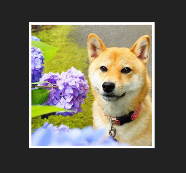
In this blog, we’ll imitate a taped photo on web browser with HTML and CSS. The following image demonstrates the intended result.

This example demonstrates some technique to utilize CSS position to achieve this effect.
First, let’s prepare the draft HTML that we are going to work with.
|
|
In this HTML template, a dark background color is chosen. We will use a pseudo element to imitate the tape. And since pseudo elements like :before and :after won’t work with replaced elements, we nest the img element within a div.
The margin: 50px auto in the .photo CSS rule specifies that the top and bottom margin of the div with a photo class to be 50 pixels and that let the browser automatically adjust the left and right margin of this div, which centers the div horizontally.
Now, we get the basic photo effect to work on.
We will use a pseudo element to imitate the tape. Then we add a CSS rule:
|
|
This CSS rule inserts a pseudo element before all the elements within the div of class .photo. The inserted pseudo element is of empty content but with specified height, width and background color. We aim to make this element to present itself as a rectangle on the web page. However, by default, this pseudo element is statically positioned and invisible on the browser. So, we subsequently give it an absolute position and zero top and zero left attribute so that it will be removed out of the typical flow of how elements are positioned on the page (by default the elements are all statically positioned) and will be scooted to the top left corner of the window.
|
|
Oops! The tape flies far apart from our photo! This is not we intended. The position: absolute; removes the element out of the flow of document and positions the element relatively to its first non-statically positioned ancestor. And since there is no non-statically positioned ancestor of .photo div. It is positioned relative to the whole browser window.
Now, if we set the .photo div to be positioned relatively and make its :before pseudo element positioned absolutely. The pseudo element will be positioned relative to its first non-statically positioned ancestor which is the .photo div in this case.
|
|
Since the div has 5 pixels width border, we specifies -5px offset to both of the pseudo element’s top and left.
|
|
Now, we have our tape placed at the top left corner of the div:
The next step is to:
- move the pseudo element left a bit
- move the pseudo element down a little bit
- rotate it counter-clockwise for 45 degree
We use translateX(), translateY(), and rotate() three functions to specify transform rule. translateX(-30%) means move the element left 30% of its own width. translateY(10%) is to move the element down 10% of its own height. Then we use rotate(-45deg) to make the element rotate 45 degree counter-clockwise.
|
|
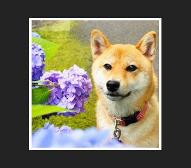
Finally, let’s add some shadow effect to both the containing div which mimics the white border of the photo and the pseudo element which is the tape here. To better improve the effect, we can put double layers of shadow behind the div. So you see two parallel specs separated by a comma in the box-shadow rule of the div element. I put the final intact HTML in the following code section.
|
|
